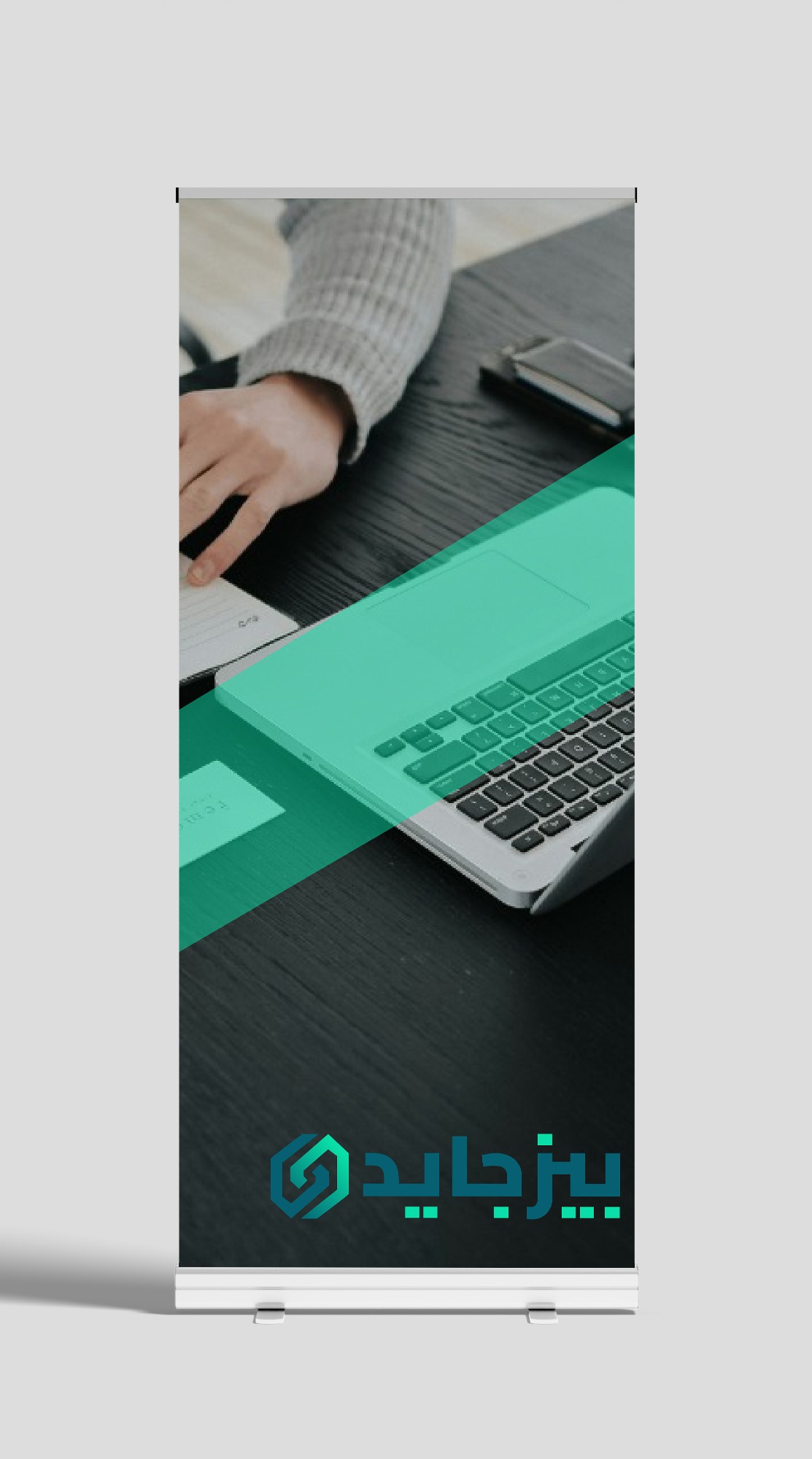
Coda Studios crafted a bold new logo for Bizguide, breathing fresh life into their brand identity. This case study delves into our creative process, the inspiration behind the design, and the vibrant transformation that now represents Bizguide's innovative spirit.

Design Systems
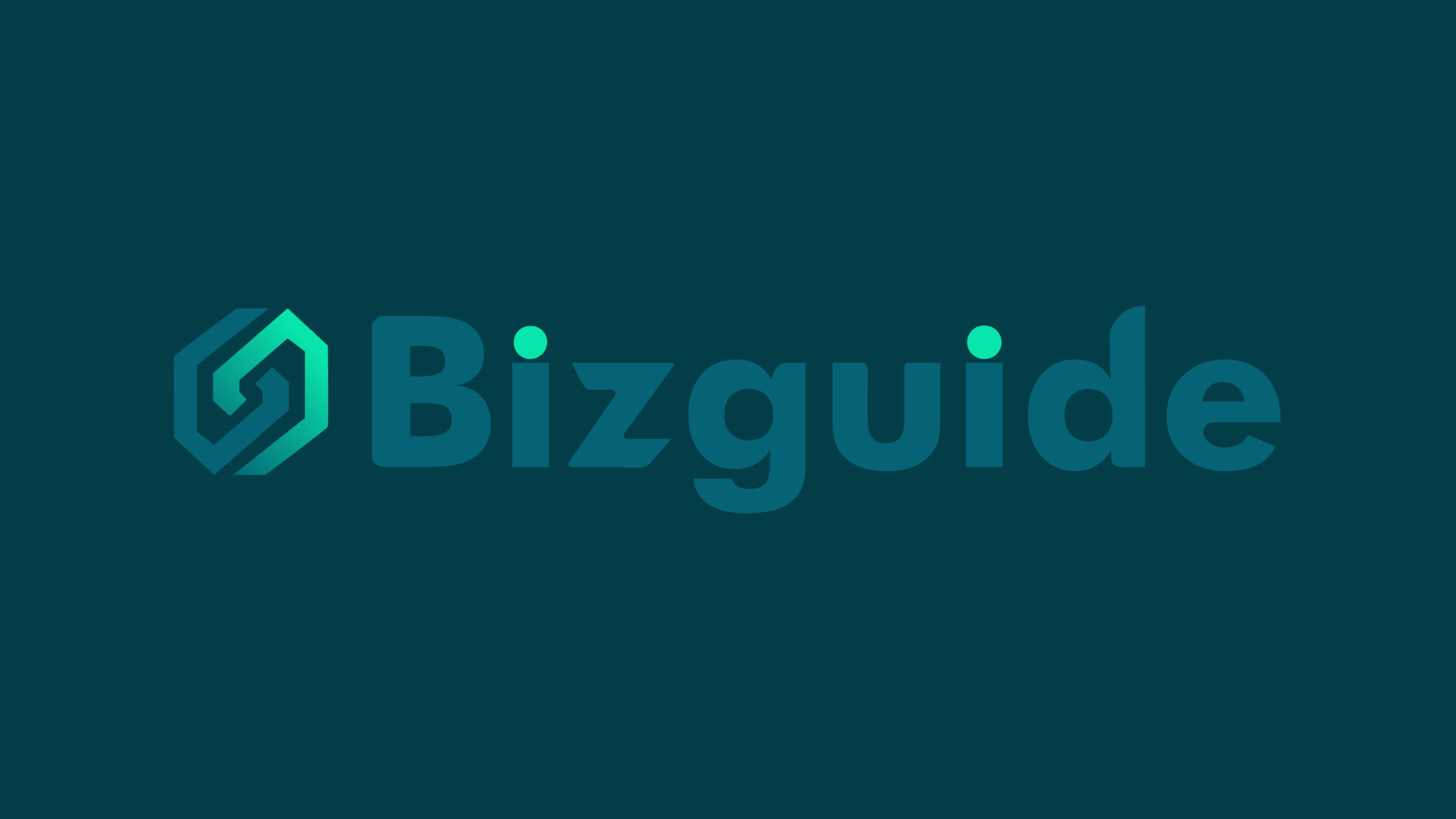
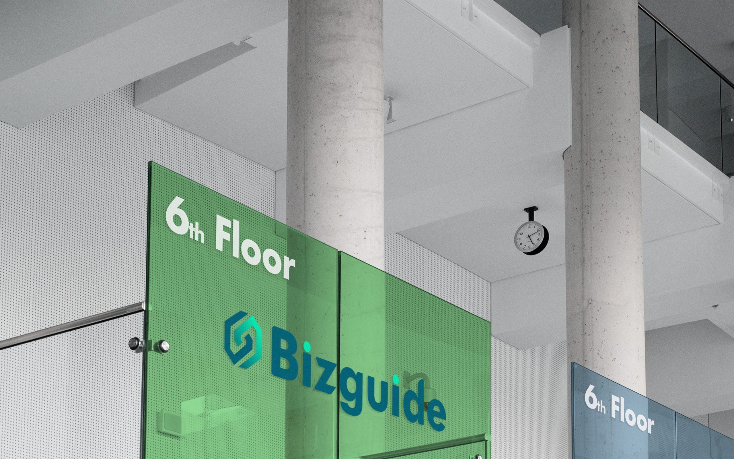
At Coda Studios, we believe in a design process that marries innovation with meaning. When tasked with rebranding Bizguide, our first step was to delve deep into their ethos, understanding their values and aspirations. Inspired by the concept of unity and collaboration, we envisioned an abstract icon mark portraying two hands clasped in support, each representing the symbiotic relationship between Bizguide and its clients. The choice of cyan and dark bluish-green hues wasn't arbitrary; it symbolizes trust, stability, and growth, essential elements in Bizguide's journey.
With a clear vision in mind, we embarked on a journey of exploration and iteration. We experimented with various shapes, forms, and color palettes, meticulously refining each element until we achieved the perfect balance between aesthetics and symbolism. Every curve, every shade was purposefully chosen to evoke a sense of connection and reliability, ensuring that the logo would serve as a powerful visual representation of Bizguide's brand identity.
The result of our design process is a logo that transcends mere aesthetics; it's a testament to Bizguide's commitment to excellence and support. Through our collaboration, we've not only revitalized their brand image but also created a symbol that resonates with their audience on a profound level, reinforcing their position as a trusted partner in the business world.