
Discover the website that a portal to a world of travel possibilities, guided by a sleek and user-centric UI/UX design system.


Design Systems
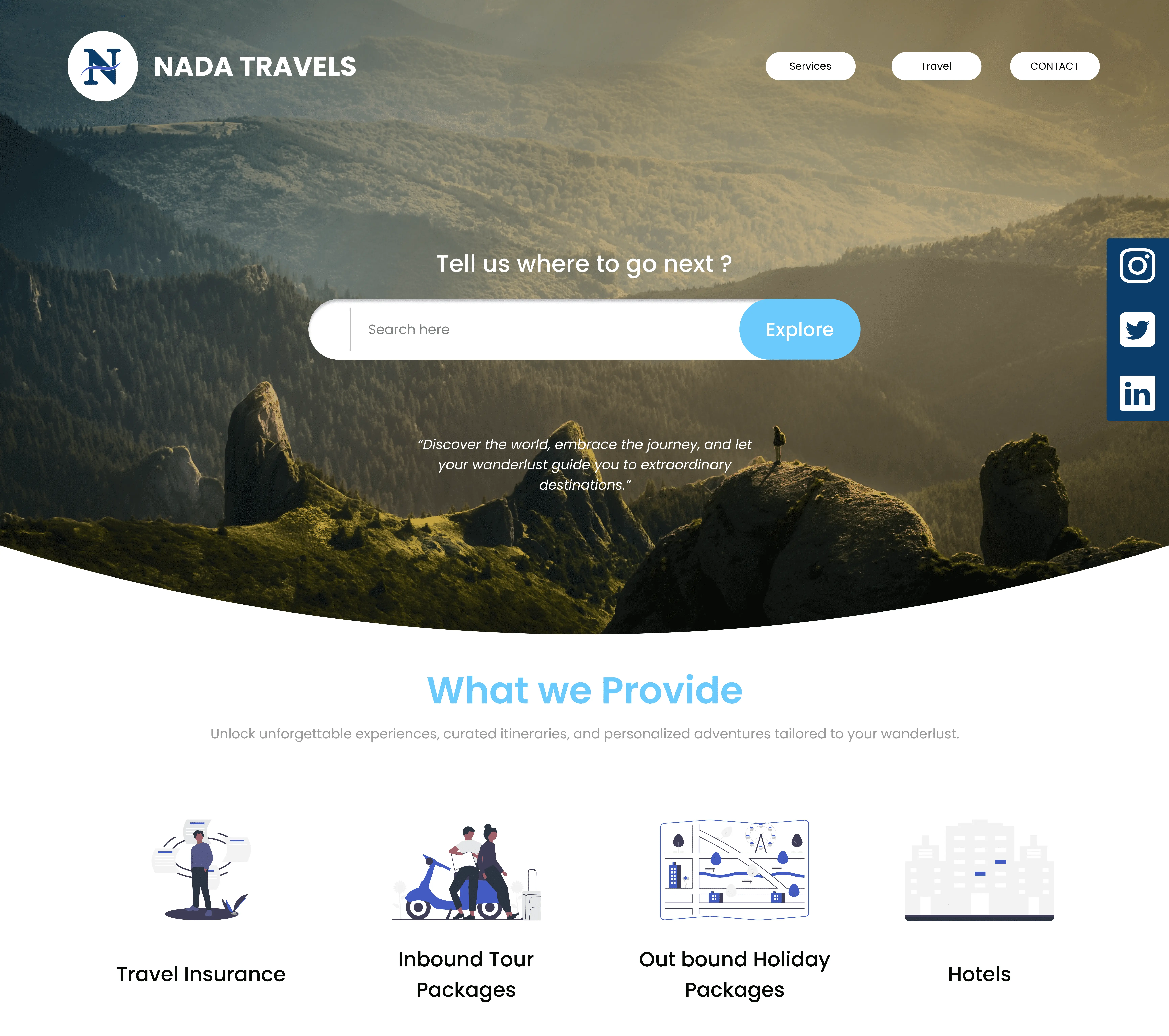
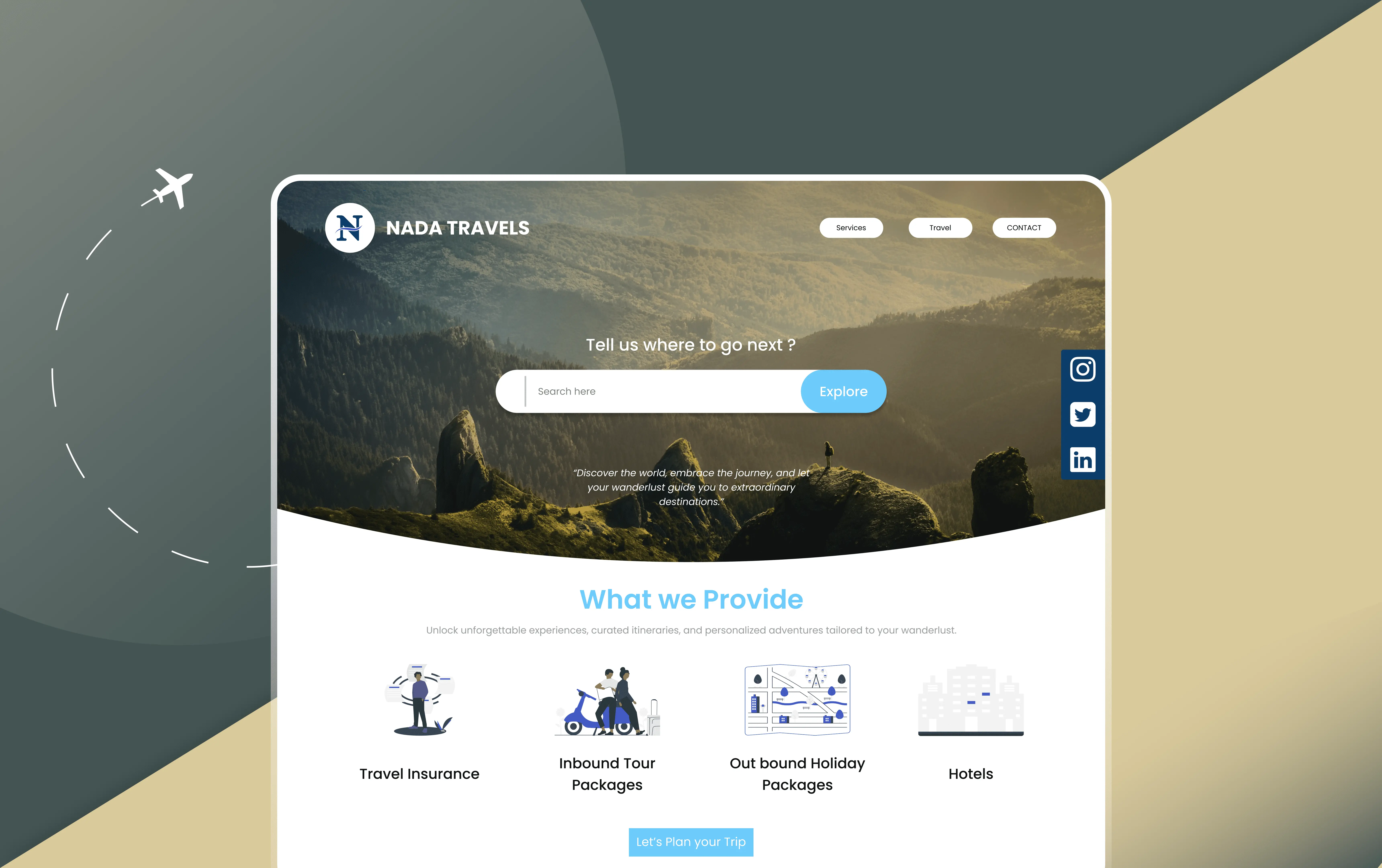
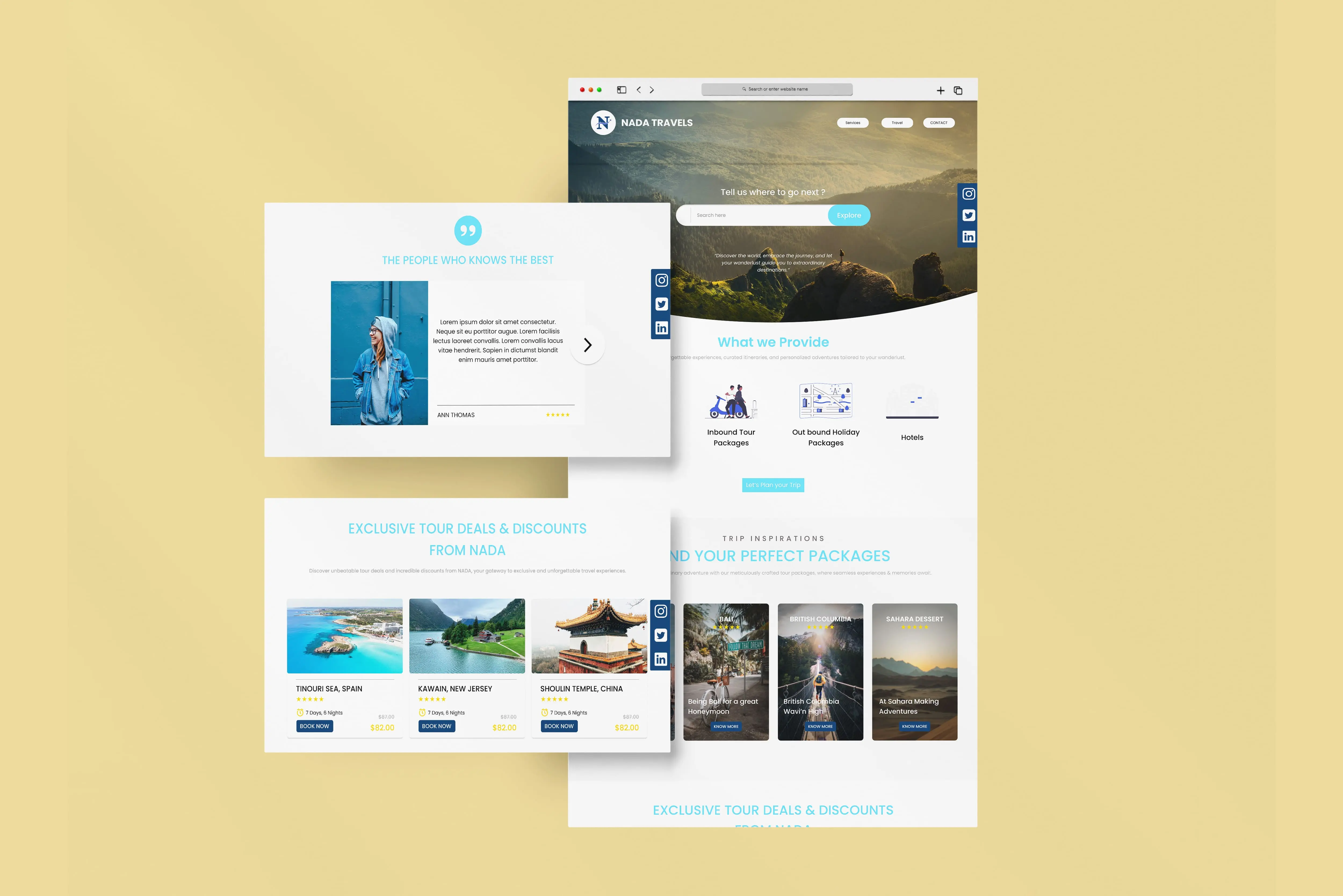
Nada Travels' website is anchored in a sleek and user-centric UI/UX design system, optimized for their single-page homepage.
The clean and intuitive layout grants users effortless access to essential sections: services, expertise, and places to visit.
With striking visuals and concise descriptions, the services segment showcases Nada Travels' offerings, while the expertise section underlines their deep industry knowledge.
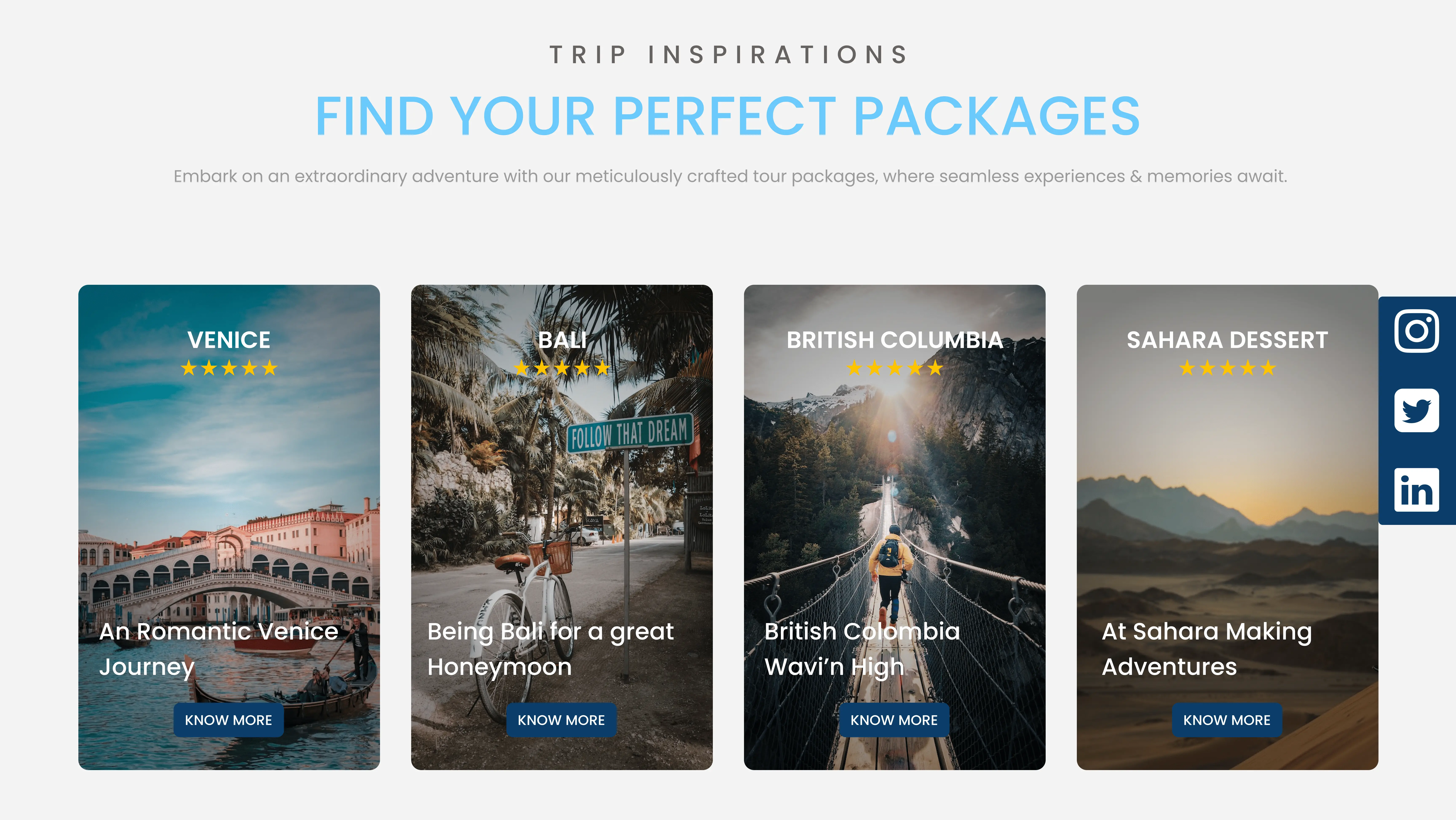
In the "Places to Visit" section, visitors embark on a virtual journey to captivating destinations. Nada Travels' design system is a testament to their commitment to user-friendliness, ensuring a seamless and engaging browsing experience for anyone seeking travel inspiration or planning their next adventure.
This design philosophy prioritizes simplicity and effectiveness, making every interaction with Nada Travels' website a delightful experience. Whether you're exploring their services, delving into their expertise, or dreaming about your next vacation spot, Nada Travels' single-page homepage serves as the gateway to unforgettable journeys, all in an elegant and user-friendly package.
