A comprehensive rebrand for our travel friends, bringing their entrepreneurial spirit and focus on small business to life via an entirely new brand language. Our year-long collaboration involved extensive customer research, qualitative testing, brand strategy, communications frameworks, and every other facet of visuals and voice you can imagine.
Design Systems
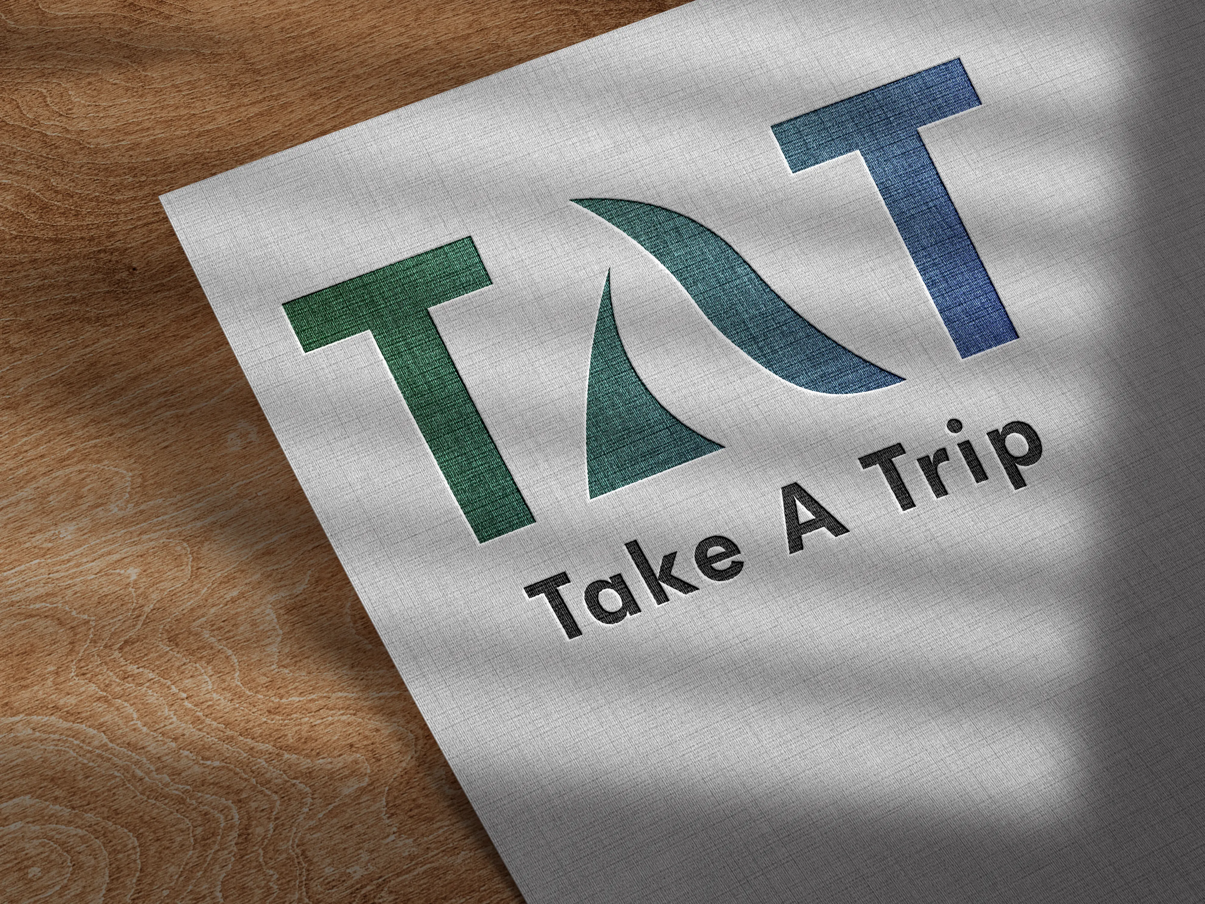
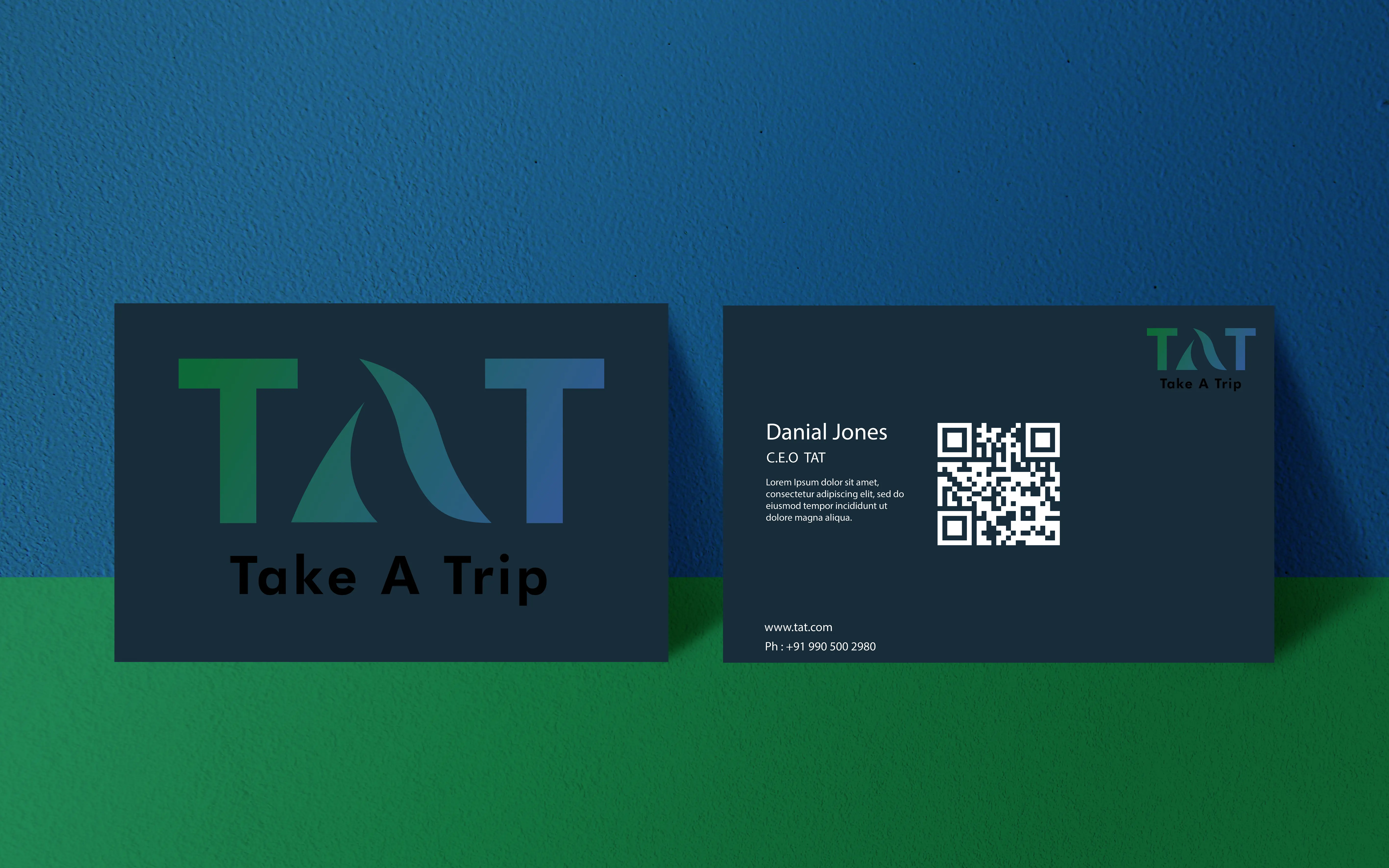
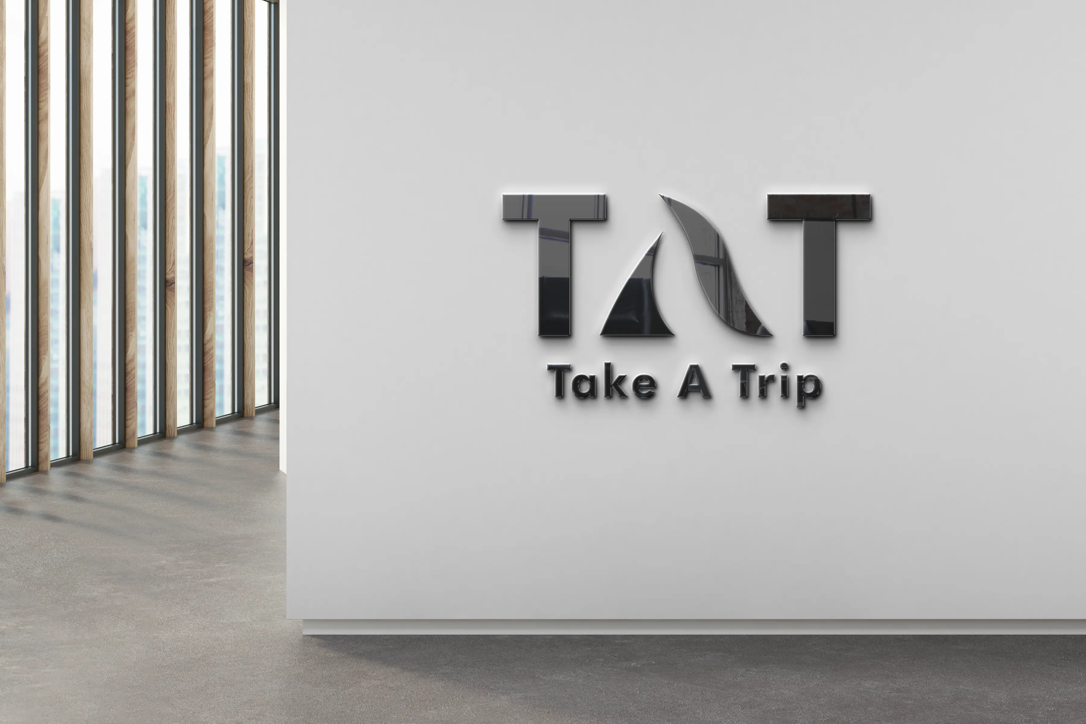
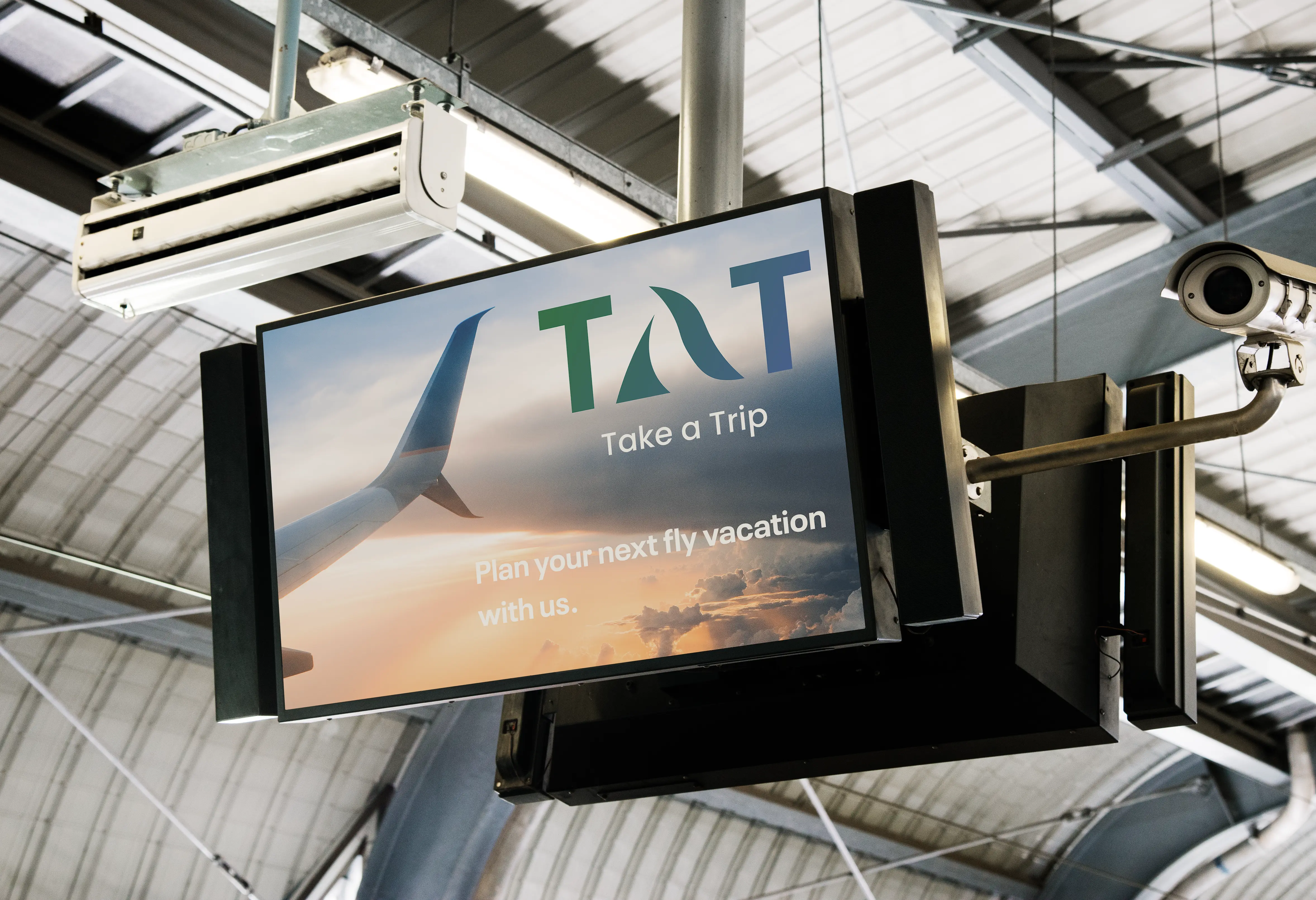
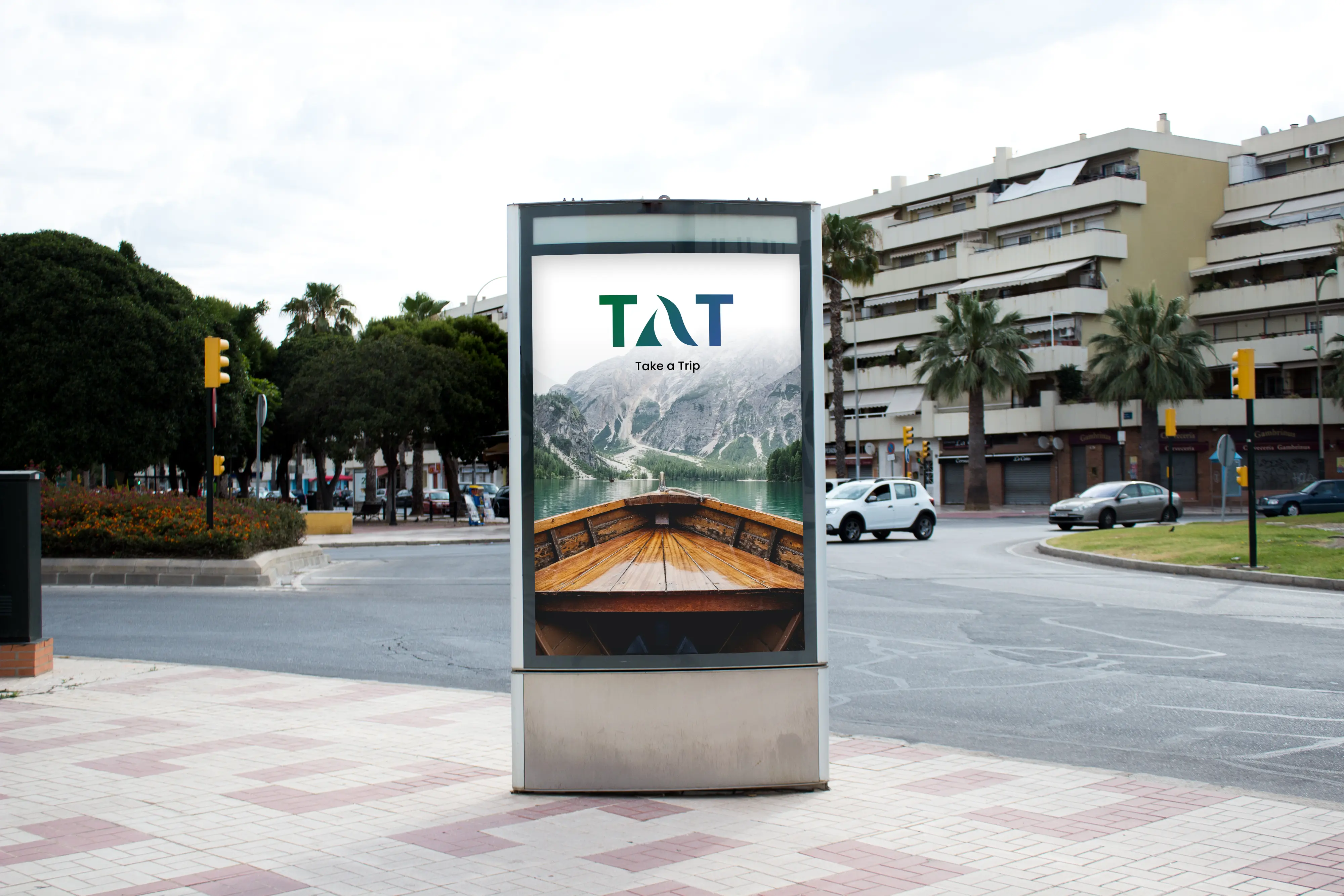
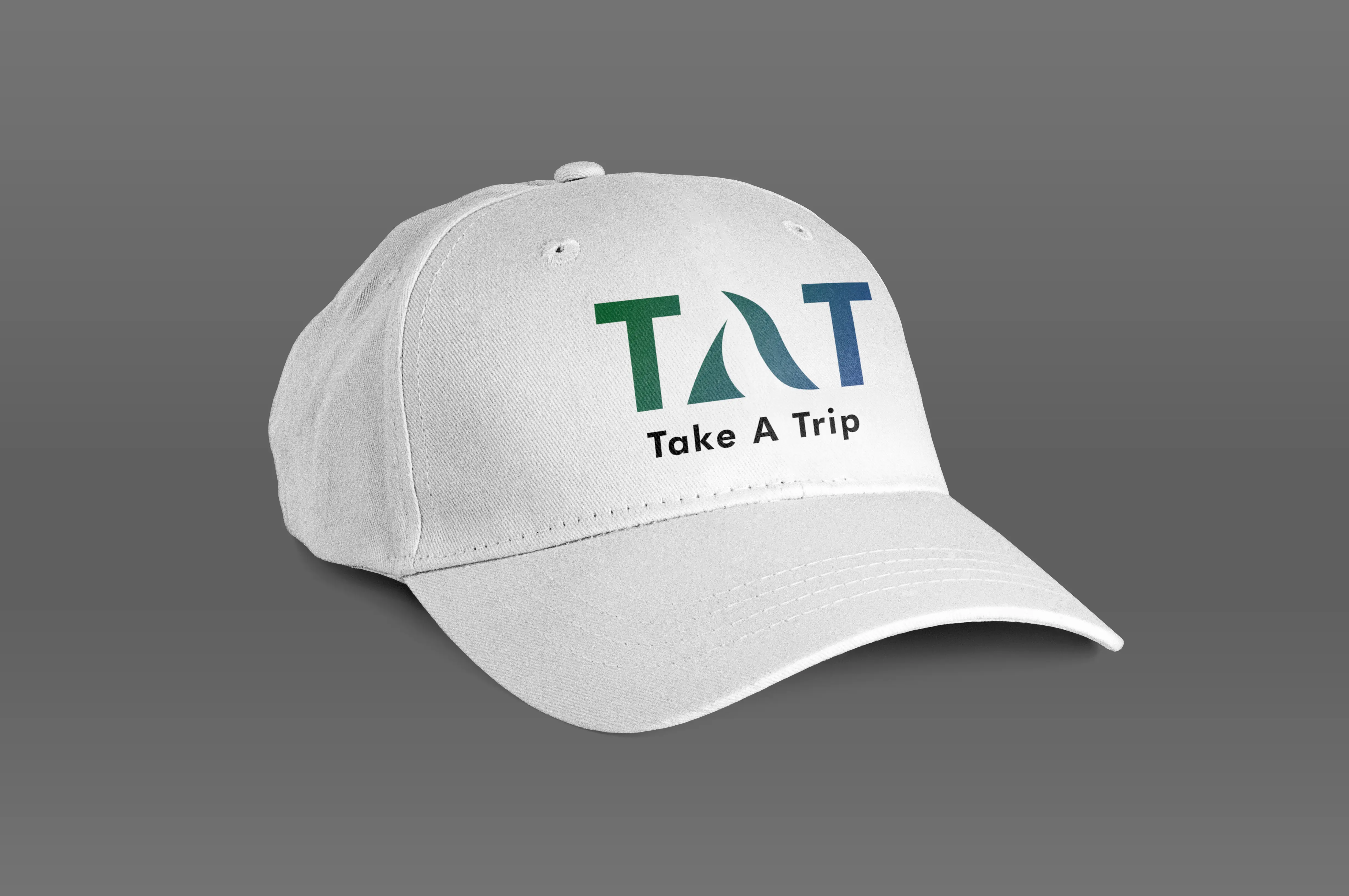
The design system for the logo rebrand of the holiday tour company, "Take a Trip" or "TAT," is a harmonious blend of creativity and elegance. At the heart of this rebrand is the lettermark,
where the letters "T," "A," and "T" take center stage. The letter "A" has been meticulously handcrafted,
adding a bespoke touch that symbolizes the company's commitment to crafting unique and personalized travel experiences.
The color palette chosen for the logo is a gradient of soothing blues and refreshing greens.
This gradient evokes a sense of adventure and tranquility, mirroring the essence of holiday travel – the thrill of exploration and the serenity of a well-deserved break.
The gradient also represents the diverse landscapes and destinations that "Take a Trip" offers to its customers