Coda Studios designed a sophisticated new logo for Doorganic, bringing a fresh and natural identity to the brand. This case study explores our creative journey, the inspiration behind the design, and how we captured Doorganic’s commitment to purity and organic quality in a distinctive visual identity.

Design Systems
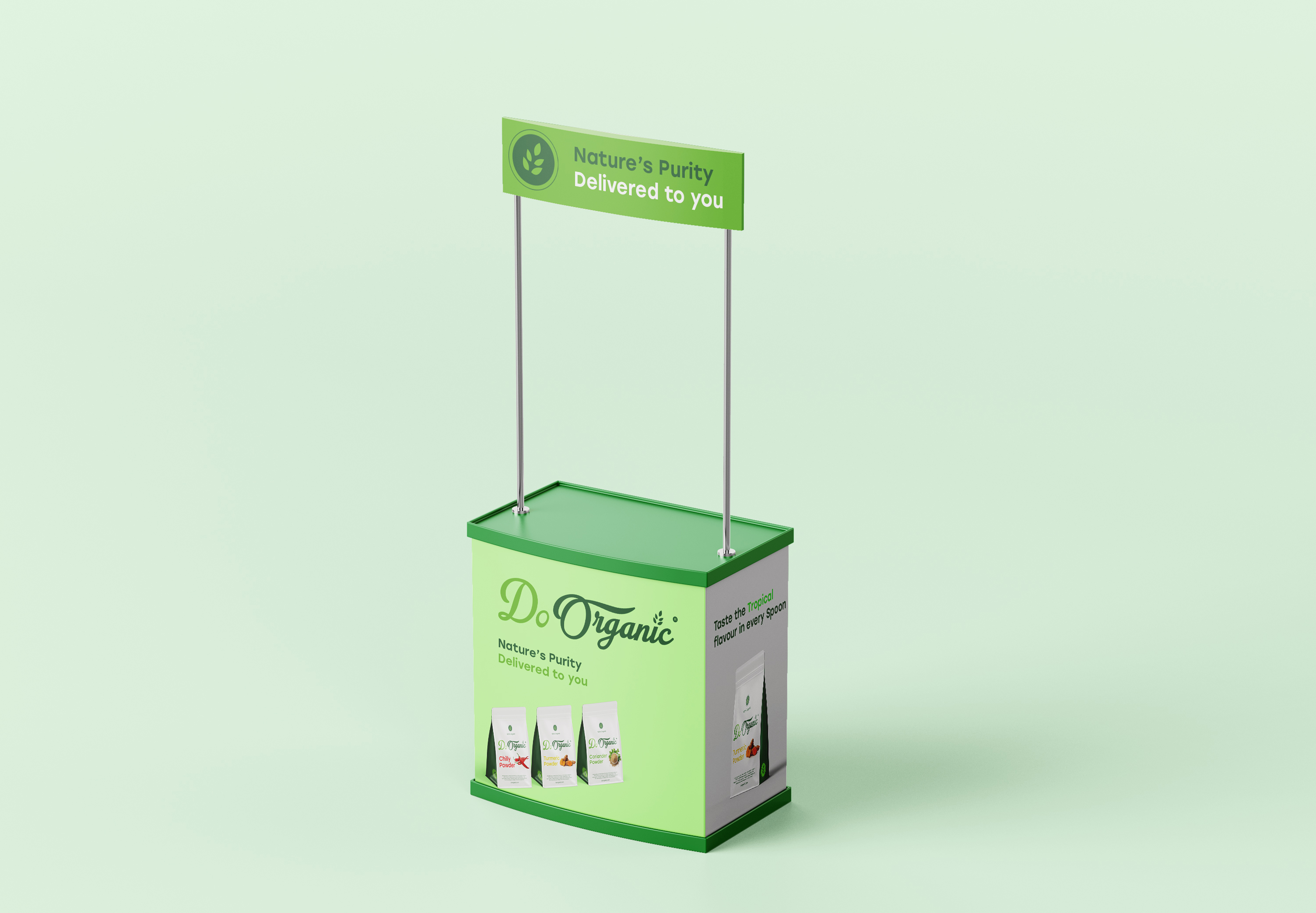
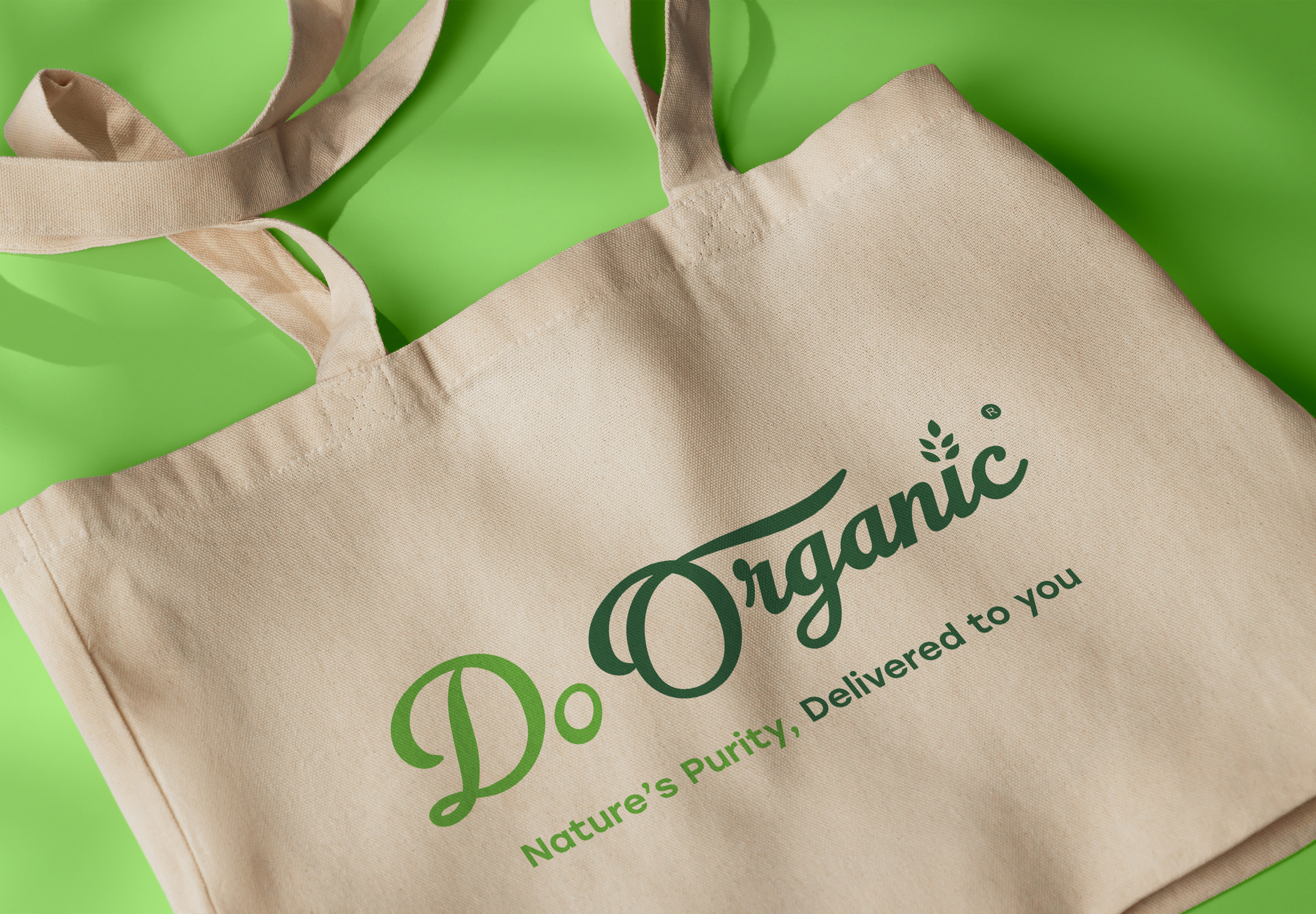
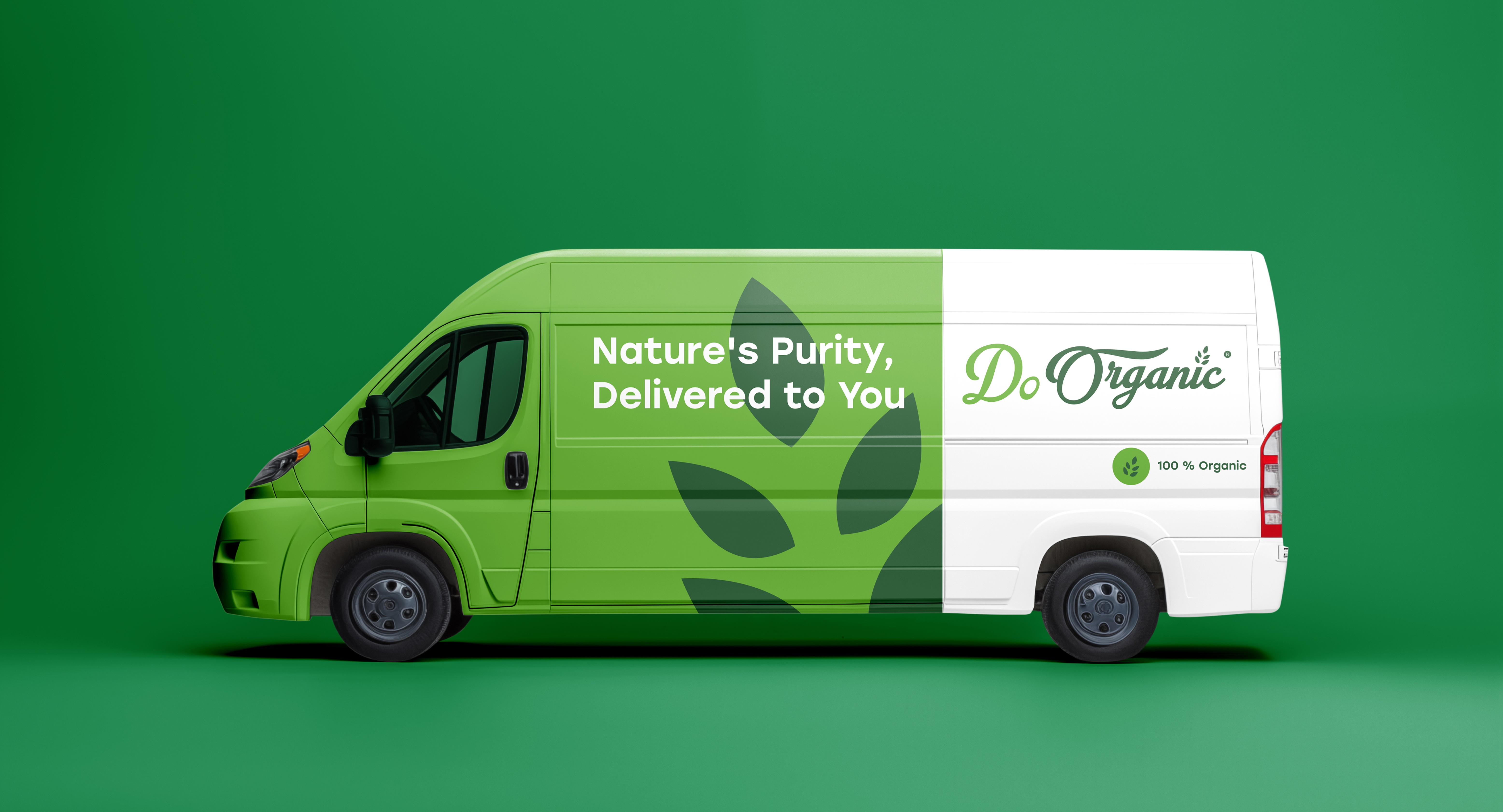
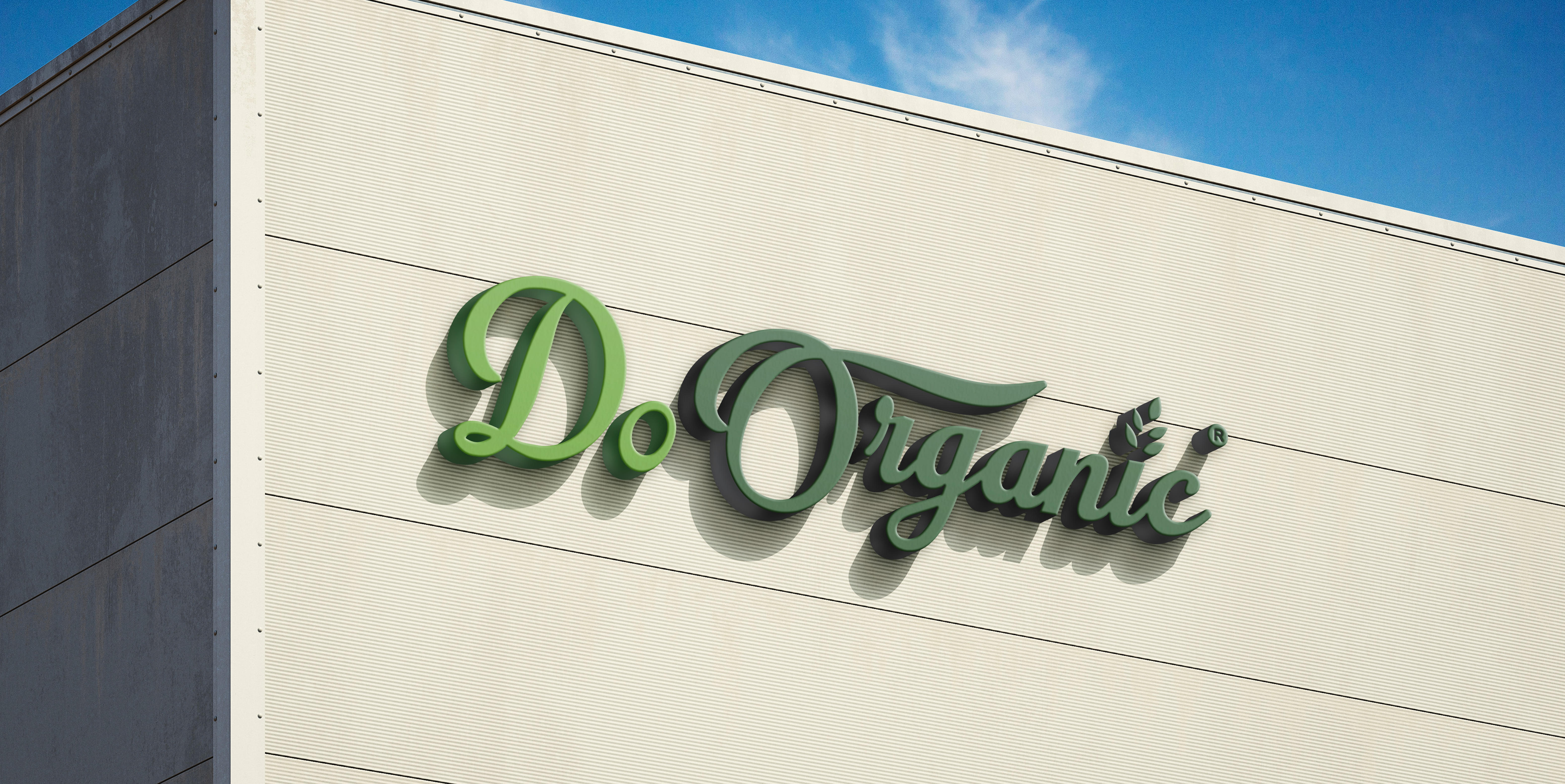
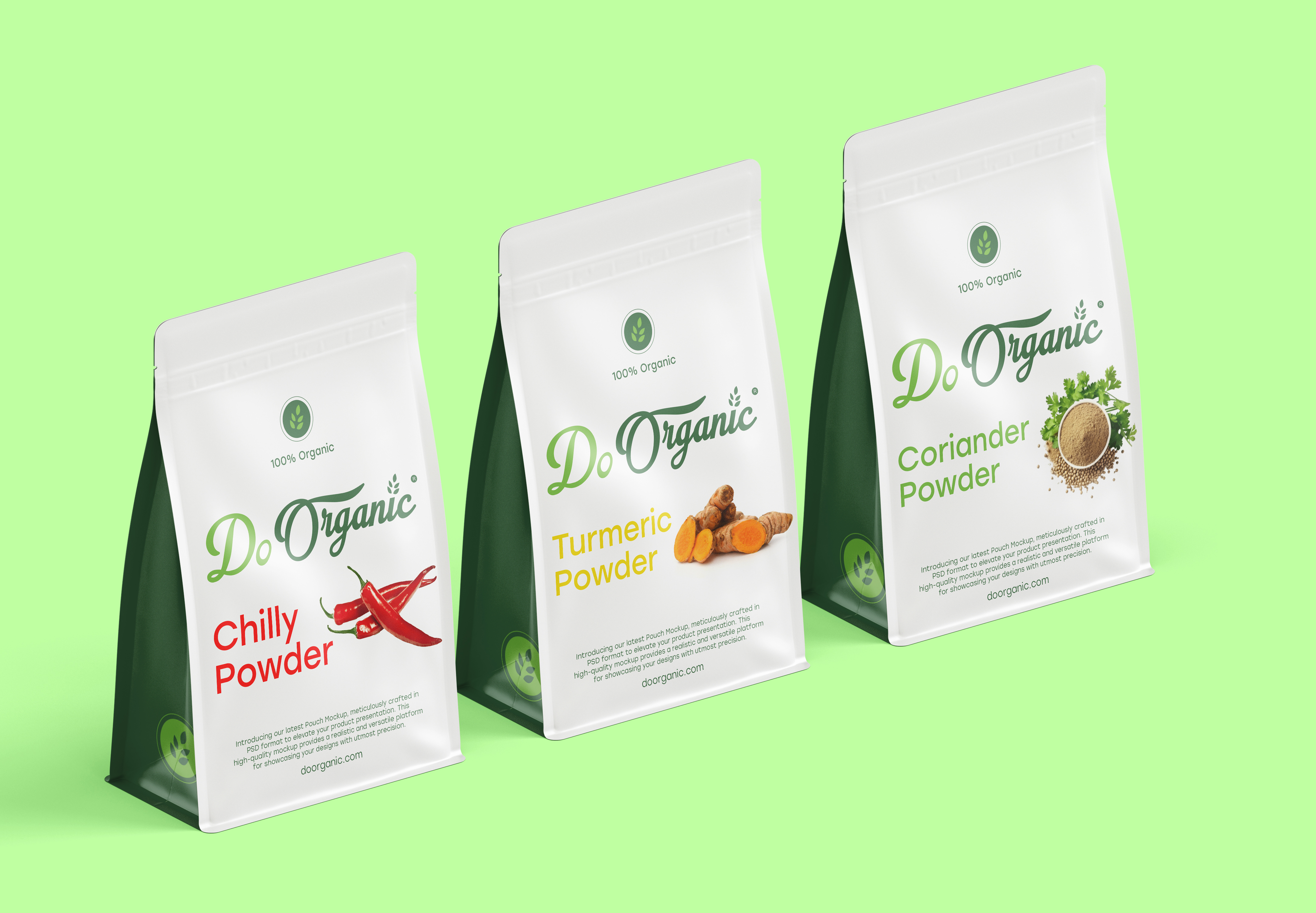
We developed a cohesive design system for Doorganic that embodies the brand's commitment to nature and purity. The logo, a wordmark crafted in the elegant script font "Lacosta," reflects the brand's natural and authentic essence. A distinctive four-leaf element replaces the dot above the letter "i," symbolizing growth and freshness, which aligns with Doorganic's values and product offerings.
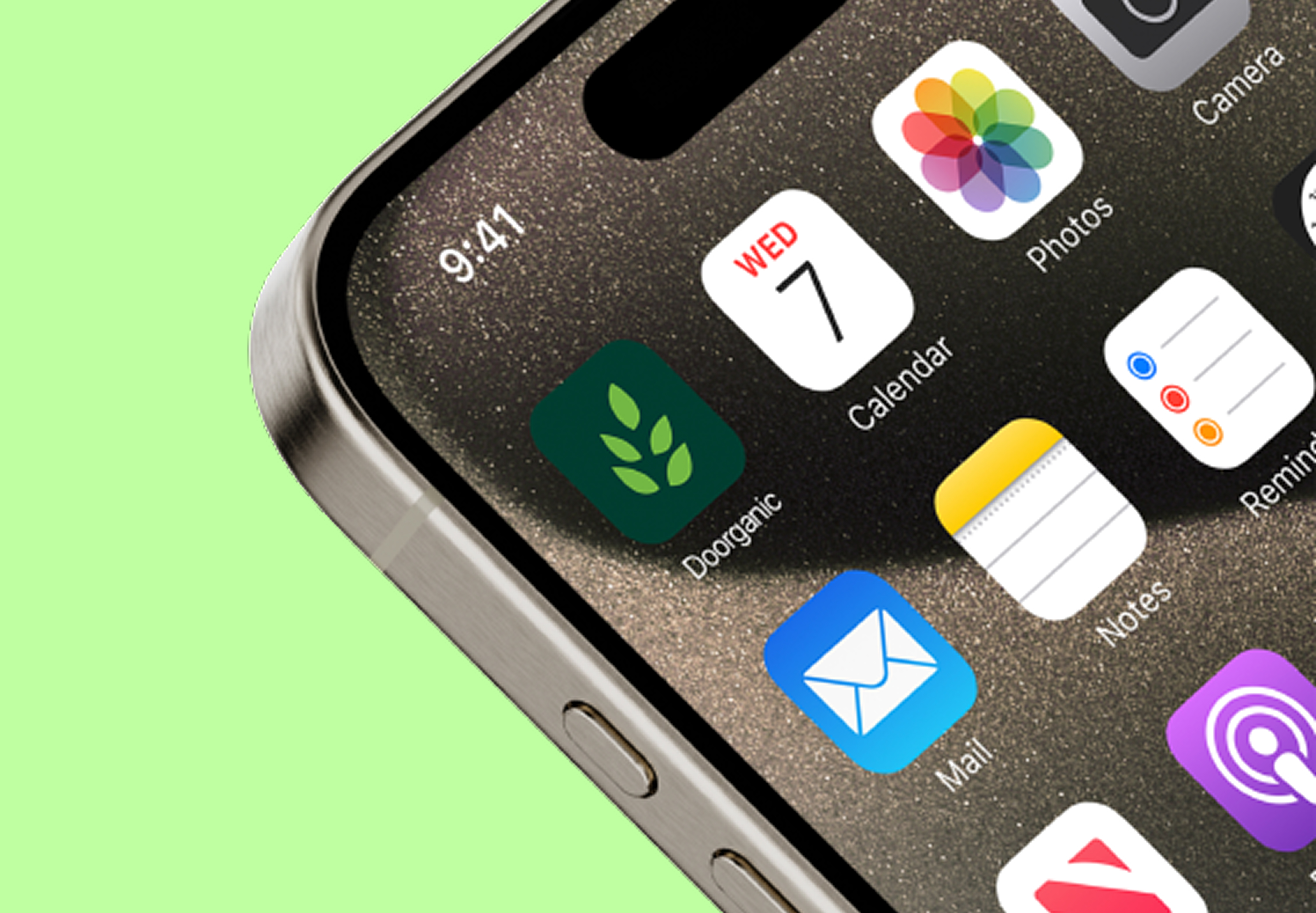
This 5-leaf element also serves as a versatile icon for digital applications, such as social media profiles and website favicons. The design system ensures the logo is adaptable and retains its clarity across various platforms and sizes, maintaining a consistent brand identity. This thoughtful approach allows Doorganic to effectively communicate its commitment to quality and nature, reinforcing its position in the market as a trusted leader in organic products.